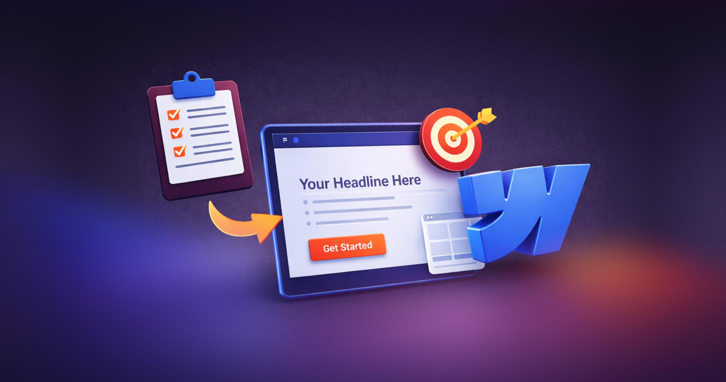
How to Build High-Converting Landing Pages with Webflow
Landing pages play a critical role in digital marketing. They offer the first touchpoint for your leads and can significantly influence whether a visitor takes the next step, signing up, making a purchase, or reaching out for more information. In fact, well-designed landing pages can dramatically boost lead generation, sales, and your overall return on investment.
Webflow has emerged as a top choice for building landing pages because their platform combines unmatched visual design flexibility with robust functionality, all without requiring heavy coding. Whether you’re a marketer, designer, or business owner, Webflow empowers you to build pages that both look stunning and convert.
Here we’ll explore how to build high-converting landing pages using Webflow, step by step, from planning and designing to optimizing and tracking results.
Understanding High-Converting Landing Pages
What Is A Landing Page?
A landing page is a standalone web page created specifically for a marketing or advertising campaign. Unlike your homepage or service pages, it’s laser-focused on driving visitors toward a single, clear goal, whether that’s downloading a guide, booking a consultation, signing up for a newsletter, or completing a purchase.
Key Features of High-Converting Landing Pages
The following are some of the key characteristics of a high-converting landing page:
- Clear Value Proposition: Instantly communicates what the visitor stands to gain.
- Focused, Action-Oriented Design: Guides the visitor’s attention precisely where you want it.
- Minimal Distractions: Strips away unnecessary navigation and competing offers.
- Strong Call-to-Action (CTA): Prominent buttons or forms that encourage visitors to take immediate action.
A well created landing page converts curious visitors into qualified leads or paying customers.
Planning Your Landing Page Strategy
Before you even launch Webflow, spend some time developing a well-planned landing page strategy.
Here are a few things to consider:
- Identify Your Target Audience and Goals: Understand exactly who your ideal visitors are, what their pain points might be, and what action you want them to take on your page.
- Choose a Single, Compelling Offer: Avoid overwhelming visitors with multiple offers. Keep your landing page centered around one primary message or goal.
- Research Competitors: Look at similar landing pages in your industry. Analyze what design elements, copy, and offers seem to resonate, and take notes on how you can differentiate yourself.
Proper planning is half the battle. It ensures your landing page content and design work together seamlessly to drive conversions.
Setting Up Your Project in Webflow
Creating Your Project
In Webflow, you can start from scratch for total creative control or choose from dozens of customizable Webflow templates built specifically for landing pages. Templates are especially helpful for speeding up your workflow and ensuring foundational best practices are in place.
Navigating Webflow’s Designer
Webflow’s Design mode is a powerful visual interface that allows you to build and style your page without writing traditional code. In the Designer, you can:
- Add and arrange sections, containers, images, and interactive elements.
- Set typography, colors, and global styles.
- Adjust responsive layouts using CSS flexbox or grid visually.
Structuring for Clarity
A logical structure keeps visitors engaged and moving toward your CTA. A typical high-converting landing page layout might include:
- Hero section: Strong headline, subheadline, and primary CTA.
- Benefits or features: What problems do you solve?
- Testimonials or trust signals: Build credibility.
- Additional details or FAQs: Handle objections.
- Footer: Keep it minimal to reduce distractions.
- Header or top menu (optional): Keep the focus on conversion.
Essential Elements of a High-Converting Landing Page
Building blocks are a must, and the following are the most essential building blocks you need in your landing page:
Headline
Your headline should be clear, bold, and immediately communicate the main benefit. It’s often the very first, and sometimes the only, thing visitors read before deciding to continue or bounce.
Subheadline
Add a brief supporting line under your headline that reinforces or expands on your value proposition.
Visuals
Relevant images, graphics, or short videos make your page more engaging. Make sure your visuals directly support your offer and don’t distract from the core message.
Value Proposition
Spell out exactly why someone should care. How does your product or service solve their problem, make life easier, or save them money?
Call to Action (CTA)
Design your CTAs with buttons that are impossible to miss. Use contrasting colors and direct text like “Get Your Free Quote” or “Start My Trial.” A CTA is more than just a button; it's a representation of the entire message and its presentation.
Put your main calls to action above the fold, and as users scroll, add more to meet them at various stages of the journey.
Lead Capture Forms
Keep forms short and simple; only ask for what’s truly essential. For more advanced campaigns, consider using progressive profiling to gather additional data over time.
Trust Signals
Testimonials, client logos, case studies, security badges, and certifications all help build trust and reduce buyer hesitation.
Minimalist Layout
A cluttered page confuses visitors. A clean, minimalist design keeps your main offer front and center, improving focus and conversions.
Optimizing for Conversion
Building the page is just the beginning. Here are a few things you can do to ensure it works as expected.
A/B Testing
Webflow makes it easy to integrate with tools that let you create and test multiple versions of your landing pages, each with variations in elements like pages that contain different headlines, CTAs, images, or layouts. You can compare how each version performs, identify what resonates best with your audience, and continue to optimize for better results.
Personalization
Integrate with platforms like HubSpot to show dynamic content based on a visitor’s location, previous activity, or source. Personalized landing pages can significantly boost conversion rates.
Responsive Design
More than half of all web traffic is on mobile (around 60% usually). Use Webflow’s responsive tools to ensure:
- CTAs are easily clickable on smaller screens.
- Text is legible without pinching or zooming.
- Sections stack naturally for seamless scrolling.
Load Speed Optimization
Fast pages convert better. Compress your images and take advantage of Webflow’s built-in optimization features to reduce load times and bounce rates.
Integrating Marketing and Analytics Tools
To truly maximize your ROI and make sure your landing page does more than just sit there, it’s essential to integrate the landing page with tools that can capture leads, nurture them over time, and give you deep insights into performance. You can consider including the following:
- Forms and CRM: Connect Webflow forms to platforms like HubSpot or Salesforce for automatic lead management.
- Analytics: Set up Google Analytics and conversion tracking, and use Webflow’s integrations for better insights.
- Optimization Tools: Heatmaps and scroll tracking tools reveal exactly how visitors interact with your page, helping you fine-tune problem areas.
SEO Best Practices for Landing Pages
Even if your landing page is primarily used for paid campaigns, organic visibility brings in valuable additional traffic.
The following are a few SEO best practices for optimizing your landing pages:
- Use SEO-friendly headings and meta descriptions that include your primary keywords.
- Add descriptive alt text to images to help search engines understand your content.
- Keep URLs clean and keyword-rich, like www.yoursite.com/lp/special-offer instead of www.yoursite.com/page123.
Common Mistakes to Avoid
It’s very important to watch out for these common mistakes that can quietly undermine even the best-designed landing pages. Avoiding the following will help keep your page focused, credible, and optimized for conversions.
- Too many CTAs: Having multiple different calls to action can confuse visitors and weaken your primary goal. If a page that says “Buy Now,” “Subscribe to Our Newsletter,” and “Book a Free Call” all at once pulls people in too many directions. Instead, stick to one main CTA and maybe a gentle secondary option like “Learn More.”
- Ignoring mobile users: Over half your visitors may be browsing on a smartphone. A landing page that’s hard to read or forces users to pinch and zoom is a conversion killer. For instance, if your buttons are too small or text overlaps on mobile, visitors will likely give up and bounce.
- No trust signals: People want to know your offer is legitimate before giving you their contact info or credit card. For example, a software product landing page with no client logos, no testimonials, and no reviews feels risky. Just adding a few short customer quotes or recognizable brand logos can dramatically boost trust.
- Not testing: Launching a landing page and never revisiting it is a costly mistake. This is too common. Imagine running the same headline for months when a simple A/B test might reveal that a different headline doubles conversions. Keep testing elements like your headline, images, CTA text, or even form length to see what truly resonates.
Launching and Iterating Your Landing Page
Pre-Launch Checklist
Before you officially go live, run through a thorough checklist to ensure everything is working exactly as intended.
- Test all your forms, CTAs, and links: Click every button and submit every form to make sure they lead to the right thank-you page or trigger the correct email.
- Review how your page looks on different devices: Check it on desktop, tablet, and mobile. Sometimes minor adjustments are necessary to improve optimization for a smartphone from a layout that works flawlessly on a laptop.
- Proofread everything: Look closely for typos, awkward phrasing, or formatting issues that might undermine your professionalism.
This careful double-checking helps you catch small problems before they impact real visitors.
Publishing in Webflow
Before going live, everything should first be tested and reviewed in the staging environment to make sure it works as expected. Once everything checks out, it’s time to publish. In just a click, your landing page will be live on Webflow’s fast, secure, and SEO-friendly hosting on your custom company domain. From there, you can start sharing your page link immediately in ads, emails, or social posts.
Ongoing Optimization
But remember, launching is just the beginning. Keep a close eye on your analytics to see how visitors engage with your page. Watch metrics like bounce rate, time on page, and form submissions to spot trends.
Run experiments on key elements such as your headline, images, CTAs, or even the length of your form fields. Continually testing and refining these components can pay off in big ways. Over time, these small, incremental improvements can lead to significant increases in conversion rates and ROI.
Conclusion
Using Webflow to create high-converting landing pages is crucial in the current competitive and dynamic marketing sphere. You can create landing pages that look great and function well by using Webflow's powerful tools, carefully crafting your content, and understanding what drives conversions. With continued testing, learning, and iteration, your landing pages will rank among the most useful tools in your marketing arsenal.
FAQs
- Do I need to know how to code to build a landing page in Webflow?
No. Webflow’s visual builder lets you design professional pages without code. However, you can add custom code for more advanced functionality if needed.
- How long does it take to build a landing page in Webflow?
With a template, you could go live in a single day. A fully custom design might take a week or more, depending on complexity and content needs.
- Can I use Webflow for A/B testing?
Yes. Webflow integrates seamlessly with tools like Google Optimize or Optimizely to help you run A/B tests and refine your page for better results.


